I was thinking that the www.before40.co.uk site needed some kind of logo to help give it 'modern' twist, & so set myself the mission of finding a logo company able to meet my strict criteria & demanding nature.
After a day of browsing round 'the net' I came accross the site of a Web designer called Samantha from www.designasite.biz - I liked their philosophy of "A design service is based on the KISS (Keep It Stupidly Simple) principle"
Anyhow a few email exchanges later and the first design was through & had an immediate impact on me. A few 'tweaks' later & we had the final design, as seen now on the site & on the top of this blog.
Sam's idea behind the logo can be explained thus:
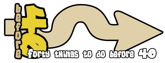
"The Sideways '40' is basically to represent 'unconventional', & also acts as a 'stop' (i.e. stops the word before). This is to tie in with doing things before forty. The arrow has a few wiggles (or 'humps' or 'hills') to graphically represent over the hill which you may be considered at forty, especially if you are trying to do some impossible things before that. Also being an arrow,
represent moving forward and not being hindered by age, hence why it points away from the number 40".
Genius.
& so the Before40 logo was born......
A Man with Forty things to do Before 40 (except he didn't quite manage to complete the challenge. So now what?)
No comments:
Post a Comment