Saturday, September 30, 2006
What a Ranker!!
It's good news today.
My Before 40 site got a page rank from Google!!
Google rates my site 4 out of 10 :-
This is brilliant for a site so new. Read all about Page Ranking here
To put the 4/10 rank into prespective, i have listed some famous sites & their Ranking:
Stat Counter = 10/10
Google = 9/10
Ebay = 8/10
Nat West = 7/10
Money Supermarket = 6/10
Francis Dunnery = 5/10
B&Q = 4/10
Daily Mail = 3/10
Frankie Goes to Hollywood = 2/10
Before Thirty = 1/10
Hope that gives you an idea of how google rates 'importance'. This also means that the Before 40 site will now be ranked higher in the search engines when typing in such things as "things to do" or "Mid-life Crisis" etc. etc.!!!!
Oh, & just incase you were wondering, my next task is coming very soon!
Tuesday, September 05, 2006
Wake Me Up Before you 'Logo'
I was thinking that the www.before40.co.uk site needed some kind of logo to help give it 'modern' twist, & so set myself the mission of finding a logo company able to meet my strict criteria & demanding nature.
After a day of browsing round 'the net' I came accross the site of a Web designer called Samantha from www.designasite.biz - I liked their philosophy of "A design service is based on the KISS (Keep It Stupidly Simple) principle"
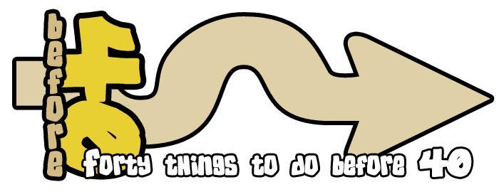
Anyhow a few email exchanges later and the first design was through & had an immediate impact on me. A few 'tweaks' later & we had the final design, as seen now on the site & on the top of this blog.
Sam's idea behind the logo can be explained thus:
"The Sideways '40' is basically to represent 'unconventional', & also acts as a 'stop' (i.e. stops the word before). This is to tie in with doing things before forty. The arrow has a few wiggles (or 'humps' or 'hills') to graphically represent over the hill which you may be considered at forty, especially if you are trying to do some impossible things before that. Also being an arrow,
represent moving forward and not being hindered by age, hence why it points away from the number 40".
Genius.
& so the Before40 logo was born......
Friday, September 01, 2006
All Change
I like Change. Change Is Good,
Change Is Fun.
So I have Changed A Task
NEW TASK!
Somewhere on the good old 'www', 'internet', 'The Web', 'The Net' etc is this new task.
It is a task in progress, but deemed 'unacceptable' or 'inappropriate' to host on the main www.Before40.co.uk site.
So I have called this task - 'The Secret Task'
It's a VERY BIG challenge & needs your help, your friends help, in fact it's gonna need a lot of help. But it is achievable.
- & It should be fun watching it's progress.
The Task itself when complete will be very 'Pleasureable' (Now there's a clue!).
So go on 'The Net' & have a search - (Think 'Keywords' of this site).
Can't find it? - Then search again.
(If you are desperate to know, email me & as long as you agree to participate, I will email you the link!)
Found it Yet?
Subscribe to:
Posts (Atom)